At first glance, designing a user interface seems very simple. You only need a few buttons. In practice, however, it is much harder than expected. The font must always be the same, the structure must be logical, and so on. I kept to tried and tested concepts when designing the user interfaces and didn’t want to invent anything new. But since the game offers so many buildings to build, I had to introduce some new ideas.
VERY FIRST USER INTERFACE
When you program a game, you very quickly need a few buttons to test. These usually don’t have to be very nice. They just have to serve the purpose. For example, to save the game quickly.

I click on these test buttons when I, as a developer, want to simulate 1000 inhabitants, even though they don’t live in the city.

Since I’m not good at drawing 2D graphics, I simply made a demo menu. I was able to simulate almost everything with it, it just didn’t look as nice. But it was sufficient for testing. You will see later how this menu has changed over time. I have changed it several times.
On the left side of the screen, I now need icons so that the player knows whether he is building an entertainment building or a fire station.
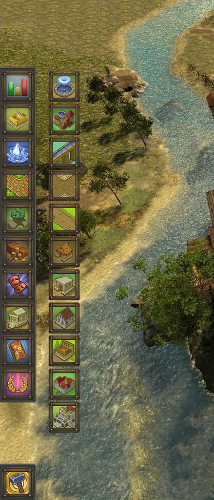
Although the 2D designer (Freelancer) created very nice icons, I found them too cute. I wanted more detailed icons. So I looked for a new 2D designer.
SECOND USER INTERFACE
After I found a new freelancer, he immediately started working on the user interface.

I liked the interface at first. But the longer I looked at it during testing, the less I liked it. It reminded me of a cartoon fantasy game. I also prefer clear edges to the soft transitions here.

Since I want to produce a game that I personally like, I had to find another solution. Nevertheless, I continue to work with this freelancer because he develops very nice 2D icons or in-game graphics:

Almost 40 icons have been designed so far. That cost me a lot of money. But that’s the way it has to be. After all, the game should look nice.
FINAL USER INTERFACE
Since I’m not a professional game developer and really don’t know anything about it, I had to painfully learn everything myself. An absolutely talented 2D artist can have a special skill, like designing beautiful icons but maybe not designing a user interface with clean lines, etc. So you need a different specialist for each job.

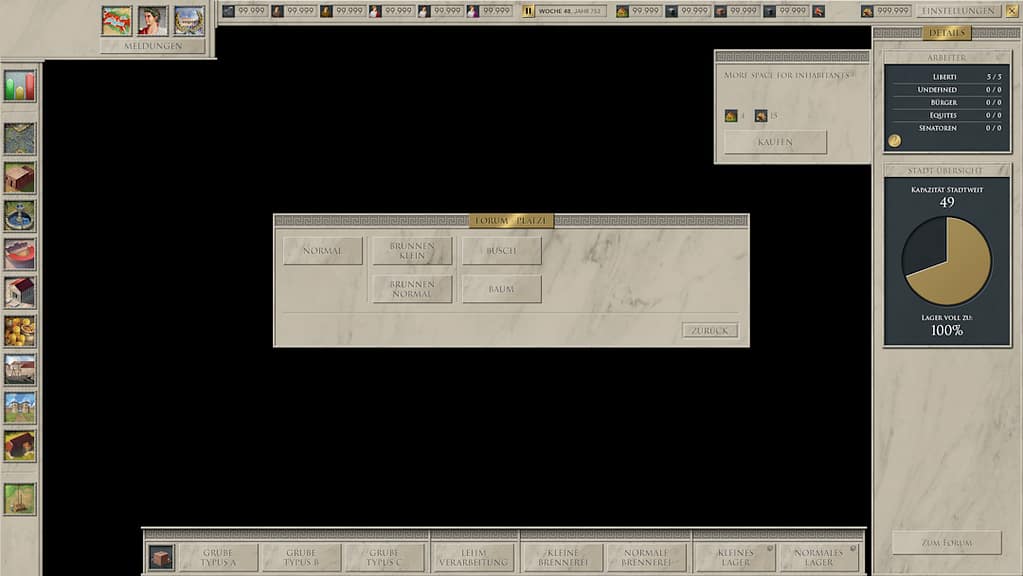
With Robin Louw [profile click here] I found a freelancer who designs exactly the user interface I always wanted. Clear, straight lines, a clean structure. He skillfully integrated the icons from the second user interface attempt and built a user interface that doesn’t seem boring to me even after many hundreds of tests.
Here is the final user interface:
If I were to make another game again someday, I would approach the process quite differently. But at least I have now learned a lot.
